As mentioned in my previous post I have some concerns about UI design in the tablets. One of those concerns is "discoverability", as described in Jakob Nielsen's summary posting about his early iPad usability study.
I found this to be a problem the first time I touched an iPad. While some things are done very well -- it didn't take a second to understand how to unlock the device -- others are pretty obscure. Note that this first screen a user ever sees even has a nice clear instruction to "slide to unlock", and a sharp-looking slider, but they could have done as well with other features inside.
I was using my father-in-law's new iPad in a quick attempt to learn enough to provide basic instruction. I got it hooked to the house network easily enough... well, with minor annoyances, but I don't recall the specifics. I do recall, however, once we got his email loaded up that the first thing we wanted to do after viewing a message was delete it. Hmm... how do you do that? Is there a nice X widget somewhere? A trash can? A button labelled "Delete"? No such luck... fortunately I'm an old hand at UI testing and troubleshooting, so after a few trial-and-error efforts I quickly found that you "swipe" sideways within the list and a shiny red "Delete" button magically appears for you to tap. Thanks for hiding that, since deleting emails is something I do, like, so rarely.
The real lesson is this: you no longer have your desktop OS highlighting the active components as you "hover" the mouse over them. With a direct-interaction interface like these tablets have, there's no "hover"... you either touch something or you don't.
My advice: look for ways to make sure the user knows what the heck she can tap, press, swipe, flick, or otherwise fiddle with. How about having a nice blue glow "evanesce" around all the active elements when a page is first displayed? Or a subtle animation where those elements periodically have a "gleam" appear in one corner (possibly supplemented by a more 3D appearance than we often see on tablets so far). Or some nice tooltip/hint things, like balloons in a comic strip, which appear next to the key controls for all new users, or if new user doesn't discover a particular feature (like that email delete button on the iPad) soon enough. These could all be subtle, and made to disappear gradually over time or even immediately upon first use of any given feature by a new user.
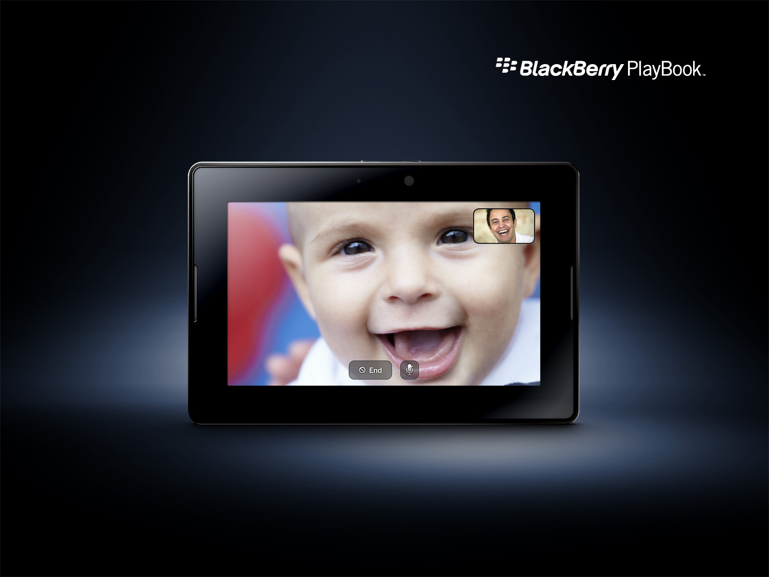
A related effect works reasonably well when a page has lots of content but few other controls. Just touching the content area makes the hidden controls appear briefly, then fade again after a second or two. Users will quickly learn that there are controls available at the touch of a finger, at which point they're all clearly visible. This wouldn't be as safe in a complex view, where touching certain elements could have an irreversible effect, so use it wisely. (I believe the PlayBook camera app uses this technique, with only a couple of primary controls always shown. Yes, I know that's actually a chat app, but the camera app looks similar and I didn't find a good picture of it yet.)